
In a world where everything’s going digital, you might be wondering if putting ink on paper is still worth your time and budget. Trust us, it absolutely is.
Think about it… when was the last time a marketing email made you say ‘wow’?
Now, think about that beautifully printed brochure or cleverly designed business card that made you take notice. That’s the power of quality digital print at work.
At City Signs, we’re passionate about helping businesses like yours make the most of their printed materials. We’re here to share some insider knowledge that could transform your next print project from bog standard to outstanding.
In this blog, we share some of our essential tips to help you get more from your digital printing.
Paper stock
Your choice of paper can make or break your print project. But it’s something most people don’t think about until it’s too late.
It’s not just about picking the prettiest option, though that helps. You need to think about weight, texture and durability.
Have you ever picked up a business card that felt a bit flimsy? That’s what happens when you go too light on the GSM (that’s grams per square metre, basically how thick your paper stock is).
For business cards, you’ll want to aim high, 350GSM or more. For that company brochure, you might want to dial it back to 180GSM to keep it practical and postable.
The environmental angle is huge these days, and rightly so. The good news? Recycled paper has come a long way. Gone are the days of dull, grey eco-paper. Today’s sustainable options look just as stunning as their traditional counterparts. Plus, your environmentally conscious clients will love you for it.
And let’s talk budget, because we all have one. While premium papers might make your wallet a bit lighter, they could actually save you money in the long run.
Think about it. If your marketing materials look and feel high-quality, they’re more likely to stick around on someone’s desk rather than heading straight for the recycling bin.
Technical elements
Here’s a common scenario we see all the time. Someone’s grabbed a lovely image from the web. It looks great on screen.
But when it prints… yikes!
That’s because what looks sharp on your monitor might turn into a pixelated mess on paper. So, always start with high-quality images.
Let’s get geeky for a moment. Resolution is the foundation of your printing. Get it wrong, and everything could come tumbling down. The magic number here is 300 DPI (dots per inch). Any less, and your images might end up looking like they’ve been borrowed from a 1990s website.
While we’re talking technical, you also need to know the difference between RGB and CMYK.
RGB (red, green, blue) is the language devices like computer monitors, LED screens, smartphones and tablets all use to create colours, combining different amounts of red, green and blue light. When you mix these lights together, they add up to make brighter colours.
CMYK (Cyan, Magenta, Yellow, Key/Black) works the opposite way to RGB. It uses inks that subtract light rather than add it. When you mix cyan, magenta and yellow inks, they absorb (or subtract) different parts of the light spectrum. In theory, mixing them all should give you black, but due to imperfections in the inks, we add actual black ink (the ‘K’) to get true, deep blacks.
Why does this matter for printing?
When you design something on your computer, you’re working in RGB. But when it comes time to print, those RGB colours need to be translated to CMYK. Sometimes, the translation isn’t perfect. Certain bright RGB colours can’t be reproduced in CMYK because they’re outside what’s called the ‘CMYK gamut’.
That’s why it’s essential to design in CMYK if you’re creating something for print, convert RGB files to CMYK before printing, and always check the proof to make sure your colours look the way you expect.
Finishes
Ready to get fancy? Here are some professional touches that can turn your digital print from ‘nice’ to ‘wow’!
First up: bleed and trim marks. Imagine trying to wallpaper right to the edge of your wall. You’d want a bit extra to play with, right? Same principle here. That extra 3mm around the edges ensures your design runs right to the edge without any awkward white borders.
Binding options are like choosing the right outfit for an occasion. Perfect binding gives you that sophisticated paperback book feel, while wire binding is ideal when you need your document to lay flat. Saddle stitching is great for thinner documents and keeps costs down.
When it comes to finishing, spot UV varnish is like adding a glossy highlight to specific areas, making them pop off the page. And foil stamping is perfect for making your logo sparkle.
Now, you might be thinking this all sounds great, but what about your budget?
Fair question.
A little touch of luxury in the right place can elevate your whole project without breaking the bank.
Maybe add some spot UV to your logo, or use foil on your contact details. It’s all about making those key elements shine.
Special finishes are a bit like seasoning. Use them sparingly and strategically. Combining finishes can create some stunning effects. But, like mixing patterns in your wardrobe, you need to be careful not to overdo it. We’ve seen some projects that tried to use every finish in the book, and the results were a mess.
Sometimes, less really is more.
Troubleshooting common printing challenges
You know that moment when your prints come back, and the colours just look… off?
Or when your beautiful design has mysterious white edges?
Even the best-laid printing plans can go a bit off track sometimes.
Most printing headaches come down to two things – how your file was prepared and what paper you’re printing on. It’s like baking. You need the right ingredients and the right recipe to make it work. So, before you start panicking about a print disaster, run through our quick checklist:
- Are your images high resolution, or did you snag them from the web?
- Is your colour space in CMYK? (RGB is for screens, remember)
- Did you include that all-important bleed (usually 3mm)?
- Have you embedded all fonts, or converted them to outlines?
- Are your blacks rich black (C30 M30 Y30 K100) for large areas?
- Have you checked all your links are up to date and packaged with your file?
- Have you proofread the text?
- Are your image resolutions consistent throughout the document?
- Are all your layers properly named and organised?
- Have you saved your file in the correct format (.pdf for print)?
Sometimes, you need a helping hand. That’s where having a good relationship with your printer becomes worth its weight in gold. At City Signs, we’ve seen pretty much everything that can go wrong with digital print.
More importantly, we know how to fix it.
How can City Signs help?
We’ve thrown a lot of information at you, but here’s the bottom line… great digital printing isn’t rocket science. But it does take attention to detail and a bit of know-how.
Whether you’re printing business cards or banners, these tips will help you get the results you’re looking for. So, if you’re considering digital print for your next project, why not give us a call?
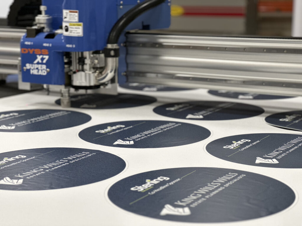
We use the latest digital printing technology to deliver high-quality graphics, signage and materials to help your business stand out. From floor to ceiling, we can print on various materials and surfaces to give them a visual edge.
Whether you need permanent or temporary solutions, we’ve got the expertise to deliver. Call us for advice or to arrange a consultation about your digital print requirements.